Color plays a powerful role in consumer psychology1. The right bag color can evoke emotion, attract attention, and influence purchasing behavior. This list reveals the top 12 colors proven to attract shoppers and elevate retail bag appeal2.
12 Best Colors That Attract Shoppers in Retail Bags

Retail bag colors like red, yellow, and blue trigger emotional responses that drive impulse buying3, brand trust, and customer loyalty.
Each color sends a psychological message to consumers. Read on to find which one best suits your product and brand strategy.
Red

Red is energetic, urgent, and attention-grabbing. It drives impulse buying and is effective in stimulating shoppers to act quickly.
Why Red Works
| Psychological Effect | Shopper Impact |
|---|---|
| Excitement | Encourages spontaneous purchases |
| Urgency | Common in clearance and sale signage |
| Boldness | Helps bags stand out on shelves |
Red creates strong visual tension that draws focus. Brands use it for sales-oriented messages or high-energy products. Though powerful, overuse may cause anxiety, so it’s best used selectively or with neutral tones.
Yellow

Yellow radiates cheerfulness and optimism. It attracts younger audiences and stimulates positive emotions in family and children's brands.
How Yellow Influences Mood
| Quality | Effect on Customers |
|---|---|
| Brightness | Evokes warmth and friendliness |
| Attention-Grabbing | Easily noticeable on crowded shelves |
| Emotional Positivity | Enhances feelings of joy |
Yellow bags are great for playful or upbeat product lines. Brands that want to convey happiness and friendliness often choose this shade to brighten the retail environment.
Orange

Orange blends the urgency of red with the cheer of yellow. It suggests fun, enthusiasm, and a call to adventure.
Ideal for Engaging and Energetic Brands
| Brand Message | Color Benefit |
|---|---|
| Confidence | Bold yet non-aggressive |
| Playfulness | Appeals to food, snack, and youth markets |
| Friendliness | Promotes brand approachability |
Different shades—from tangerine to burnt orange—offer various retail personalities. Used well, orange attracts younger and fun-seeking shoppers.
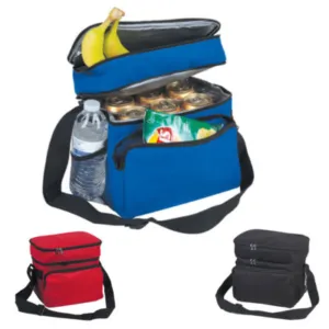
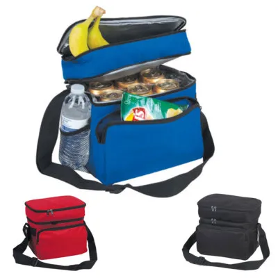
Blue

Blue builds trust, calmness, and reliability. It appeals to logic and reassurance, often used in tech, healthcare, and finance sectors.
Blue’s Trust-Building Power
| Psychological Cue | Retail Effect |
|---|---|
| Calmness | Reduces shopper anxiety |
| Professionalism | Adds credibility and consistency |
| Loyalty | Encourages long-term customer trust |
Cool blues convey control and order. It's perfect for brands needing to build authority or appeal to more serious buyer intentions.
Green

Green connects with nature, health, and sustainability. It aligns well with eco-friendly messages and products related to wellness and organic living.
Natural Choice for Eco-Conscious Brands
| Attribute | Customer Perception |
|---|---|
| Health & Growth | Suggests organic or wholesome products |
| Environmentally Friendly | Enhances green brand values |
| Balance & Calm | Reduces visual tension |
Soft and earthy greens appeal to environmentally aware consumers. It’s a must-have for modern sustainable packaging strategies.
Brown

Brown is dependable, organic, and earthy. It brings a grounded feel, ideal for handmade, artisanal, or natural products.
Brown for Authenticity
| Emotional Tone | Best Use Cases |
|---|---|
| Stability | Signals reliability and tradition |
| Natural Appeal | Great for food, coffee, and crafts |
| Warmth | Adds rustic or homegrown character |
Recyclable kraft paper tones reinforce the message of sustainability and quality. It’s often used to appeal to minimalist and environmentally driven audiences.
Black

Black is sleek, formal, and luxurious. It denotes sophistication and exclusivity, especially when paired with metallics.
Luxury and Elegance
| Signal | Shopper Interpretation |
|---|---|
| High-End | Adds value to premium products |
| Mystery | Sparks curiosity |
| Authority | Communicates confidence and strength |
Luxury fashion, jewelry, and tech brands often choose black bags for a polished and upscale image. It works best when simplicity is key.
White

White suggests purity, cleanliness, and minimalism. It enhances other colors and provides a blank canvas for elegant designs.
Simplicity and Versatility
| Trait | Shopper Response |
|---|---|
| Clean Aesthetic | Reinforces hygiene and clarity |
| Flexibility | Works with any brand palette |
| Timelessness | Feels organized and traditional |
White works across sectors from healthcare to fashion. When combined with bold accents, it can create strong brand recognition while keeping things simple.
Turquoise

Turquoise reflects clarity, freshness, and calm. It’s a soothing alternative to traditional blue, often used for wellness and self-care products.
Fresh and Inviting
| Color Effect | Retail Benefit |
|---|---|
| Tranquility | Reduces visual clutter |
| Clarity | Associated with cleanliness |
| Soft Elegance | Perfect for modern skincare and health |
Turquoise gives brands a refreshing, clean look without appearing too sterile. It feels modern and comforting at once.
Burgundy/Wine Shades

Burgundy represents luxury, elegance, and timeless charm. It adds depth and richness, making products feel more valuable.
Sophistication Without Flash
| Color Use | Visual Impact |
|---|---|
| Subtle Glamour | Appeals to fashion-conscious buyers |
| Depth and Warmth | Enhances feeling of richness |
| Versatile Pairing | Combines well with golds, neutrals |
Deep reds like burgundy are ideal for stylish seasonal items or luxury accessories. They blend traditional elegance with modern flair.
Earthy Greens (Olive, Forest, Khaki)
These natural shades reflect resilience and timelessness. They signal outdoor practicality or sustainability, depending on the tone and texture.
Organic and Durable Appeal
| Hue | Impression Given |
|---|---|
| Olive/Forest | Rugged, eco-conscious aesthetic |
| Khaki | Soft neutrality for seasonal balance |
| Functional Green | Adds maturity to retail presentation |
These greens adapt well across seasonal trends and are increasingly seen in luxury fashion and sustainable lifestyle packaging.
Soft Pastels (Pale Pink, Mint Green)

Pastels are trendy, gentle, and nostalgic. They convey softness, femininity, and subtle luxury in fashion-forward or premium lifestyle products.
Subtle Statements
| Shade | Shopper Response |
|---|---|
| Pale Pink | Romantic, gentle, approachable |
| Mint Green | Fresh and modern |
| Visual Lightness | Enhances product delicacy |
Pastels work well for baby items, skincare, and boutique fashion. Their soft nature attracts detail-oriented shoppers seeking elegance and calmness.
Conclusion
Choosing the right color for your retail bag can significantly influence buyer behavior. Warm shades attract attention, cool tones build trust, and neutrals enhance sophistication. At JiaRong Packing, we offer full customization, letting your packaging speak your brand’s message clearly and beautifully.
Our clients in fashion, food, and eco-friendly sectors love how color boosts their visibility. Which colors work best for your market? Share your thoughts below!
Want expert guidance on your next PP woven bag order?
We’re here to help with free mockups, custom design, and competitive pricing.
Zhejiang Jiarong Packaging Co., Ltd.
Specialized in PP woven bags, non-woven bags, and custom eco packaging.
👉 Visit us at zjjrpackaging.com
-
Understanding consumer psychology can help you tailor your marketing strategies effectively. Explore this resource to enhance your knowledge. ↩
-
Learn how retail bag appeal can significantly impact consumer choices and enhance your brand's visibility. This resource is essential for marketers. ↩
-
Discover the psychological factors that drive impulse buying to optimize your sales strategies. This link will provide valuable insights. ↩