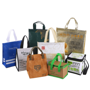
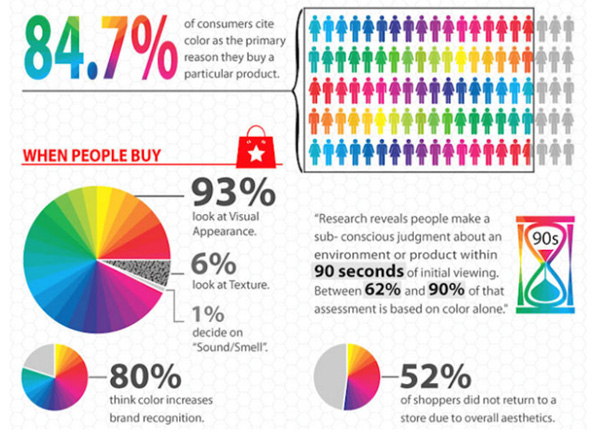
Color influences how customers perceive your brand and decide what to buy. This article explores 12 colors that can make your retail bags more attractive and psychologically persuasive to shoppers, backed by insights from branding and color psychology.
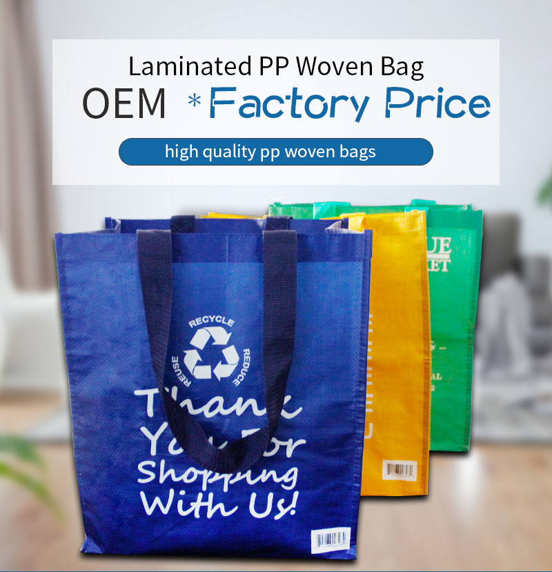
Color choice in retail bags[^1] influences shopper emotions, brand perception, and impulse buying behavior. The right color can improve product visibility, memorability, and sales.
A bag’s color isn’t just about looks—it shapes how your customer feels. Find out which colors drive shopper response below.
Red – Urgency and Boldness
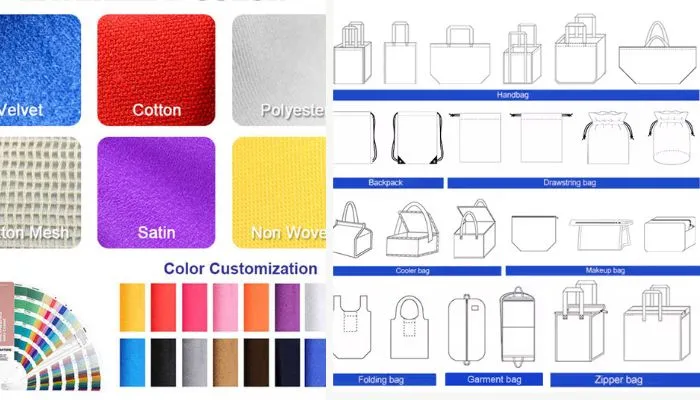
Dive-Deeper paragraph: Red is a high-energy color that stimulates action. It triggers the brain’s urgency response[^2] and can prompt shoppers to make quick buying decisions. Brands often use red on limited-time offers or clearance sales because it creates a sense of excitement. However, too much red may increase stress or make the design feel aggressive. A strategic approach—such as red handles, accents, or callouts—can attract attention without overwhelming the customer.
Ideal Applications for Red Bags
| Application | Example | Strategy |
|---|---|---|
| Clearance Sales | "Final Sale" red print | Create urgency for impulse buys |
| Youth Markets | Red base, bold typography | Attract attention in busy stores |
| Food Packaging | Red sides + clear logo | Stimulate appetite and passion |
Yellow – Cheerfulness and Optimism
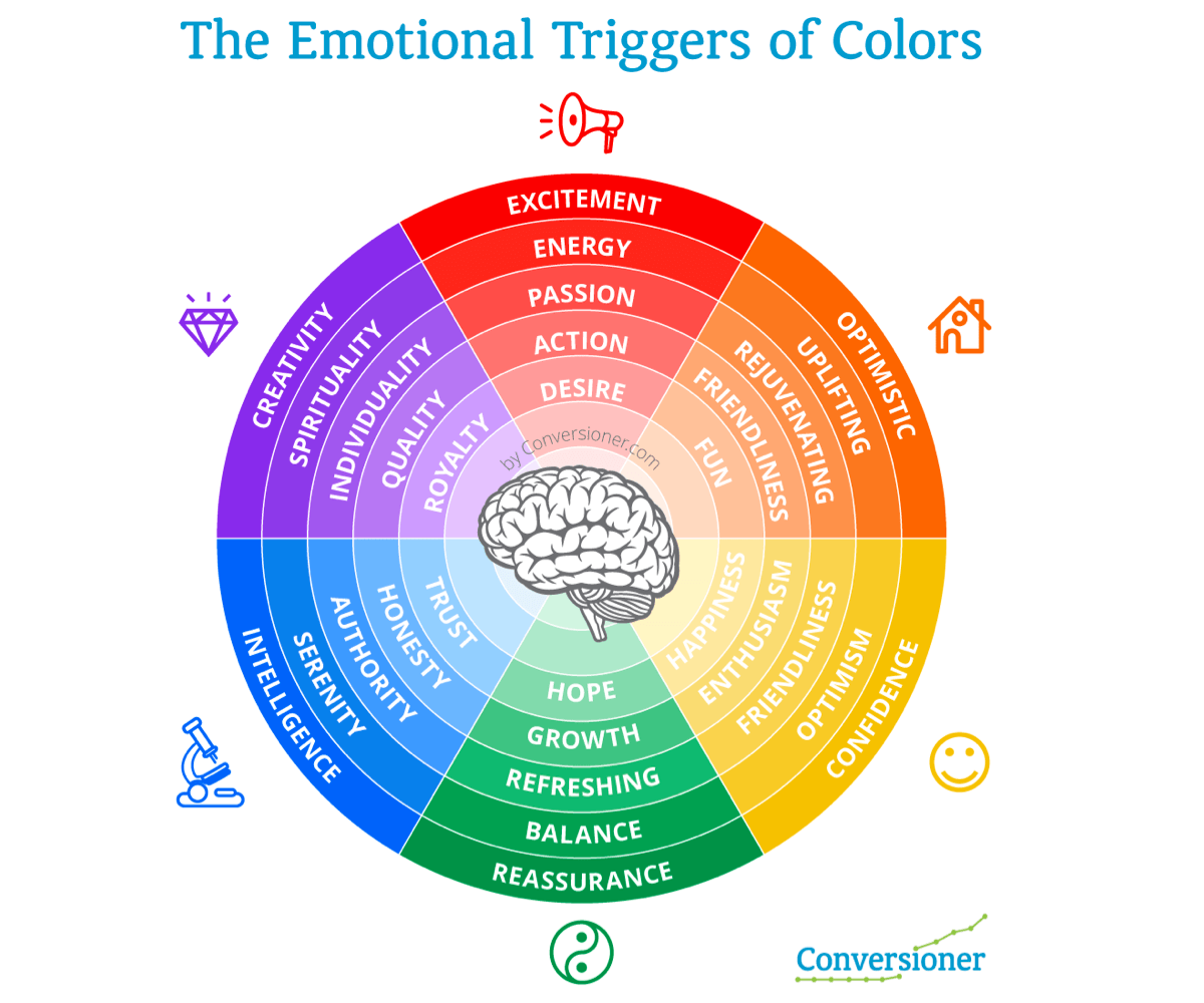
Dive-Deeper paragraph: Yellow is associated with happiness, energy, and youthfulness. It grabs attention even in cluttered environments, making it ideal for busy retail shelves. Yellow retail bags give off warmth and friendliness, often appealing to families and younger shoppers. While bright yellow can be eye-catching, pastel or gold-infused yellows may offer a more sophisticated alternative. Too much yellow, however, can become overwhelming and should be balanced with white or muted tones.
Common Uses of Yellow in Retail
| Target Audience | Bag Style | Message Conveyed |
|---|---|---|
| Children’s Stores | Yellow with cartoon prints | Fun and playfulness |
| Fast Fashion | Yellow accents + white base | Optimistic and trend-aware |
| Bakeries | Warm yellow kraft bag | Fresh and inviting |
Blue – Trust and Stability
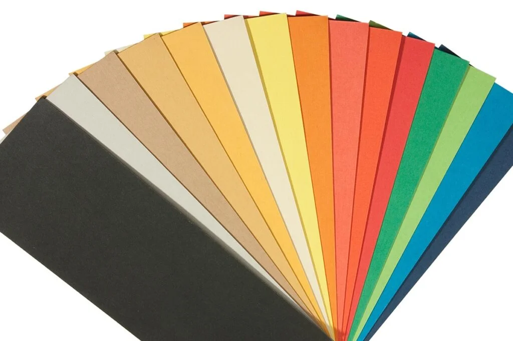
Dive-Deeper paragraph: Blue calms the viewer and inspires trust. It is widely used by tech companies, healthcare providers, and financial institutions because it communicates reliability and calm. Dark blue suggests authority and tradition, while light blue leans toward freshness and innovation. For retail bags, blue tones work well when promoting thoughtful, long-term products or services. Blue also reduces anxiety during decision-making, which helps in high-ticket or sensitive purchases.
Blue Tones and Their Psychological Cues
| Shade | Associated Meaning | Ideal Industries |
|---|---|---|
| Navy Blue | Authority, depth | Finance, law, premium goods |
| Sky Blue | Openness, clarity | Wellness, skincare |
| Aqua/Turquoise | Refreshing, modern | Tech gadgets, fitness |
Green – Natural and Sustainable
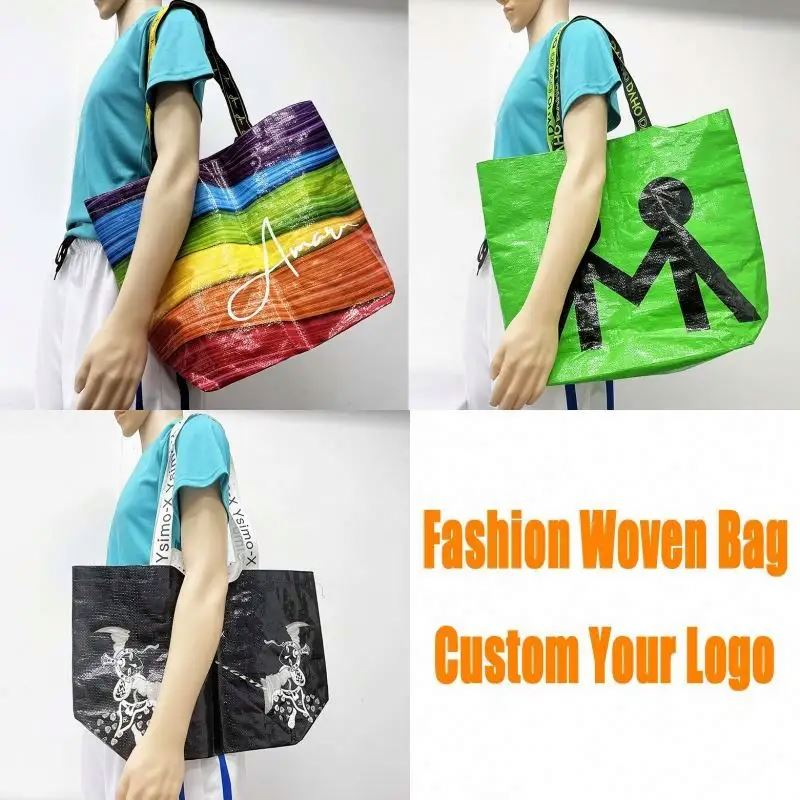
Dive-Deeper paragraph: Green connects directly to nature and health. It signals environmental responsibility, wellness, and balance. This makes it a popular choice for brands marketing eco-friendly or organic products. Forest green conveys luxury and maturity, while lime green feels youthful and energetic. Shoppers associate green bags with sustainability, which can enhance a brand’s appeal to eco-conscious buyers. Use recycled materials to further reinforce the message visually and functionally.
Green Color Strategies in Retail Bags
| Shade | Best Use Cases | Buyer Reaction |
|---|---|---|
| Olive/Khaki | Outdoor gear, eco lifestyle | Practical, earthy feel |
| Forest Green | Organic groceries, boutique gifts | Luxury and depth |
| Light Green | Wellness and self-care items | Fresh, calming, honest |
Orange – Fun and Approachability
Dive-Deeper paragraph: Orange combines the cheer of yellow with the urgency of red. It creates a feeling of fun, affordability, and energy. Orange bags are great for drawing attention to brands aimed at youth, entertainment, and budget-conscious consumers. However, it’s important to pair orange with a balancing color like gray, white, or dark blue to avoid overwhelming the shopper.
Where Orange Works Best
| Retail Segment | Bag Design Idea | Emotional Trigger |
|---|---|---|
| Fast Food | Bright orange + black text | Fast, fun, and appetizing |
| Toy Stores | Orange bag + playful logo | Excitement and joy |
| Streetwear Brands | Burnt orange + minimal font | Energetic, yet urban cool |
Brown – Authenticity and Earthiness

Dive-Deeper paragraph: Brown represents stability and authenticity. It gives a handmade, honest vibe, ideal for artisanal or natural products. Kraft paper bags, in particular, signal eco-consciousness and minimalism. Brown also appeals to customers who prefer understated design. Its association with nature makes it a favorite for cafes, bakeries, and niche fashion labels.
Brown Packaging Use Cases
| Product Type | Bag Material | Message |
|---|---|---|
| Organic Soaps | Kraft paper | Handmade and ethical |
| Coffee Beans | Brown canvas | Authentic, reliable |
| Vintage Apparel | Matte brown finish | Heritage and stability |
Black – Luxury and Power
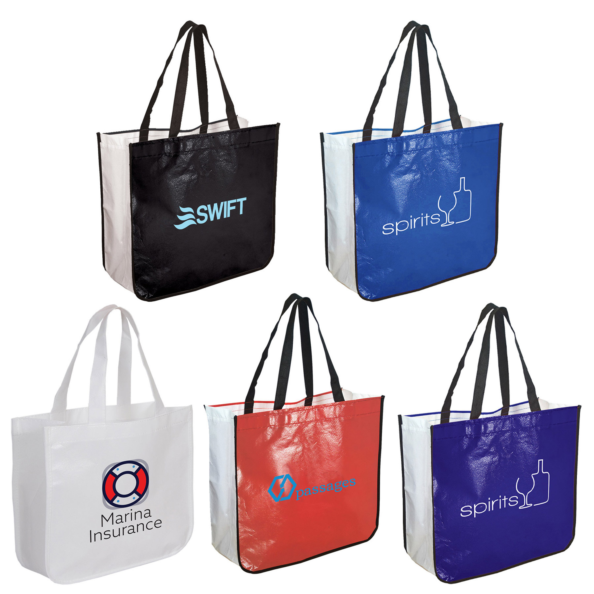
Dive-Deeper paragraph: Black is associated with elegance, exclusivity, and authority. It's widely used in high-end fashion, electronics, and cosmetics. A matte black bag with gold foil stamping instantly elevates the perceived value of the brand. But black should be used carefully, as it may feel too cold or distant if not balanced with softer visuals or textures.
Popular Black Bag Variations
| Finish | Use Case | Effect Produced |
|---|---|---|
| Matte Black | Jewelry packaging | Sleek and understated |
| Glossy Black | High-tech gadgets | Bold and futuristic |
| Black + Metallic | Fashion or premium drinks | Luxurious and dramatic |
White – Cleanliness and Simplicity
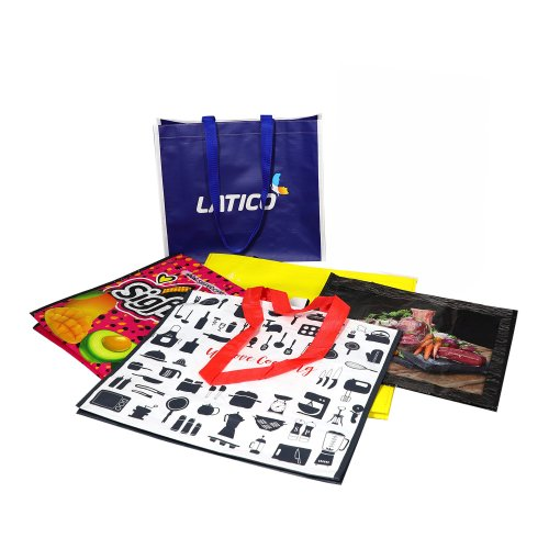
Dive-Deeper paragraph: White offers a neutral canvas that enhances other elements like logos, patterns, or foil stamping. It conveys purity, transparency, and clarity. White bags are ideal for premium health, beauty, or tech brands that want a clean, professional look. It also allows flexibility in seasonal or campaign-specific customization.
Why White Stands Out
| Industry | Packaging Style | Brand Message |
|---|---|---|
| Skincare | White bag + soft texture | Clinical, gentle, pure |
| Electronics | White base + bold logo | Smart, minimalist |
| Bridal Stores | White + silver embossing | Elegance, innocence |
Turquoise – Clarity and Refreshment
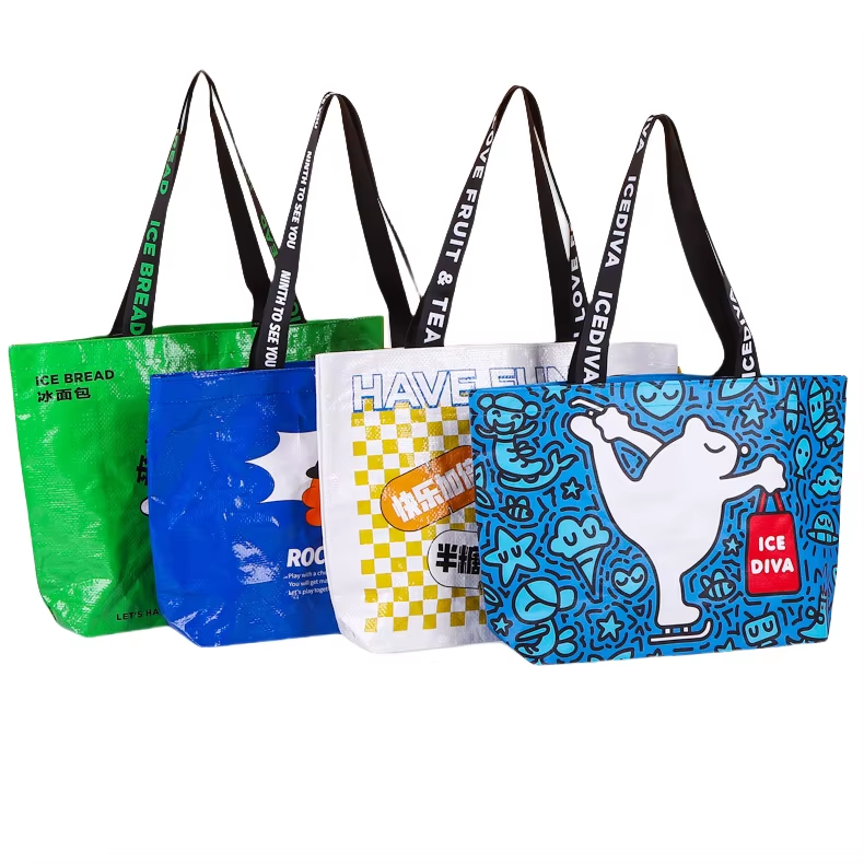
Dive-Deeper paragraph: Turquoise blends blue and green tones to create a refreshing, tranquil effect. It stands out in retail environments without being loud. Brands use it to convey modern self-care[^3], water purity, or clarity. Turquoise bags offer a sense of escape and calm, which is ideal for spas, wellness shops, and personal hygiene products.
Top Turquoise Bag Applications
| Sector | Design Focus | Customer Response |
|---|---|---|
| Wellness | Soft turquoise + logo | Calm and clean |
| Water Products | Aqua + minimalist font | Refreshing and trusted |
| Boutique Skincare | Turquoise + floral prints | Fresh and feminine |
Burgundy/Wine – Richness and Timelessness
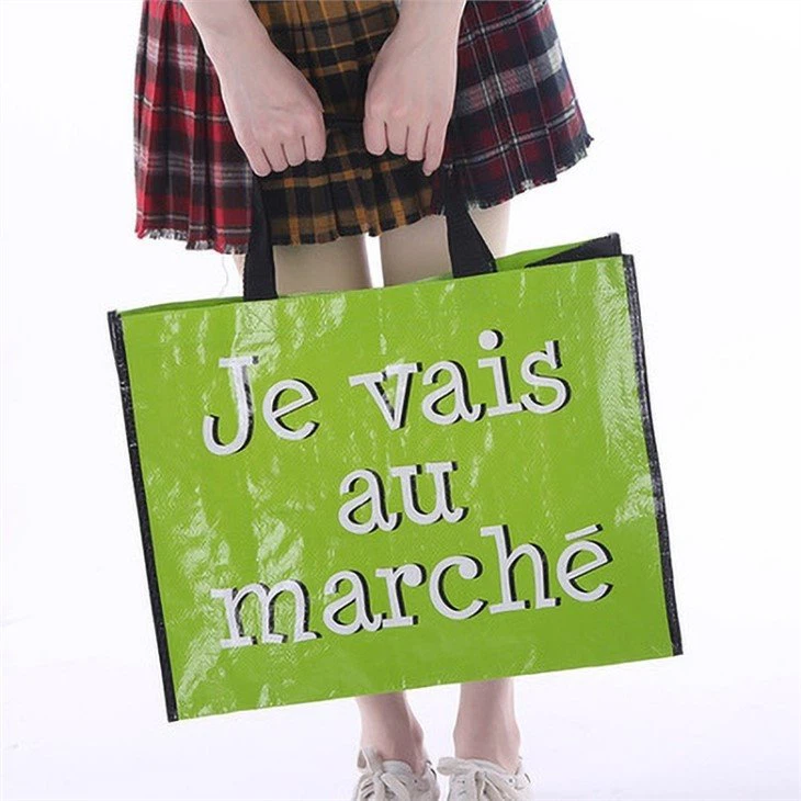
Dive-Deeper paragraph: Burgundy and deep wine colors bring depth, sophistication, and a touch of nostalgia. These tones appeal to mature, luxury-minded audiences. They are often seen in packaging for upscale products like perfumes, fashion, and gourmet foods. Their richness creates a sense of warmth and exclusivity.
Where Burgundy Bags Excel
| Application | Material Style | Appeal |
|---|---|---|
| Seasonal Promotions | Velvet-finish wine bags | Festive and indulgent |
| Premium Apparel | Wine gloss + silver print | Rich and elegant |
| Gift Packaging | Deep red matte | Timeless and personal |
Earthy Greens – Practicality and Eco-Awareness
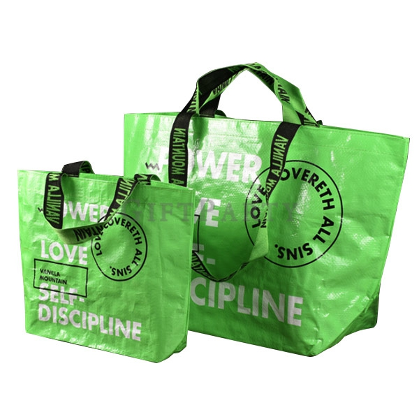
Dive-Deeper paragraph: Earthy greens like olive, khaki, and forest green convey ruggedness, reliability, and environmental connection. They’re perfect for brands that want to show sustainability without being overly flashy. These greens appeal to outdoor, lifestyle, and eco-luxury audiences. Combined with natural materials, they strengthen a brand’s environmental credibility.
Sample Use Cases for Earth Tones
| Product Category | Suggested Combo | Consumer Perception |
|---|---|---|
| Camping Gear | Olive + stitched logos | Durable, nature-focused |
| Sustainable Fashion | Khaki canvas + minimal font | Responsible and stylish |
| Organic Foods | Forest green kraft paper | Wholesome and grounded |
Gold and Silver – Prestige and Celebration
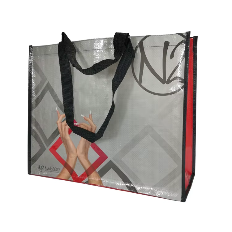
Dive-Deeper paragraph: Gold and silver symbolize elegance, wealth, and festivity. These metallics catch light, making them visually striking in store displays. Gold feels warm and traditional, while silver feels modern and high-tech. Used for limited editions or special events, they elevate the perceived value of products and leave a lasting impression.
Where to Use Metallics
| Color | Best Use Cases | Impression Left |
|---|---|---|
| Gold | Holiday promotions, jewelry bags | Opulent and celebratory |
| Silver | Tech packaging, cosmetic kits | Sleek and forward-looking |
| Both | Anniversary gifts, VIP packs | Luxury and exclusivity |
Conclusion
Each of these 12 colors has a unique psychological effect on shoppers. Choosing the right one for your retail bag depends on your product, audience, and brand identity. At JiaRong Packing, we often help our clients match colors to their market goals. For example, we’ve seen how switching to green kraft paper boosted eco product appeal in Europe, while black and gold accents helped elevate luxury fashion branding in North America.
Which colors work best for your customers? Share your ideas or questions below!
---

[^1]: Discover the most effective colors for retail bags to attract shoppers and boost sales.
[^2]: Understand the urgency response and how it can drive quick purchasing decisions.
[^3]: Explore color choices that align with the modern self-care movement.