6 Visual Design Elements That Strengthen Brand Identity
Visual design directly impacts how customers see your brand. These six key design elements form a consistent and recognizable brand identity that stands out in the market. This list helps you evaluate and apply them effectively.
6 Visual Design Elements That Strengthen Brand Identity

Quick View: A strong visual identity depends on six elements: logo, color palette, typography, shapes, imagery, and consistency. Each plays a unique role in building recognition and trust.
Want to know how these design pieces create a lasting brand impression? Read on to discover their impact.
1. Brand Logo1
A logo is the face of the brand. It’s often the first thing people remember. It should be clear, simple, and unique.
What Makes a Strong Logo?
- Simplicity2 helps recall
- Uniqueness avoids confusion
- Relevance connects to brand mission
- Scalability ensures clarity in all sizes
Logos create emotional links. A simple mark like Nike’s swoosh or Apple’s apple becomes a shortcut for quality, values, and memory.
| Key Feature | Benefit |
|---|---|
| Simplicity2 | Easy to recognize |
| Relevance | Reflects brand purpose |
| Uniqueness | Avoids visual confusion |
| Flexibility | Works across all platforms |
Practical Tip
Ask: Can someone draw your logo from memory? If yes, it’s doing its job.
2. Brand Color Palette3
Colors speak even when words don’t. They guide emotions and shape perceptions.
Emotional Meaning of Colors
- Red: passion, urgency
- Blue: trust, calm
- Green: growth, nature
- Black: luxury, strength
- Yellow: energy, optimism
Limiting your palette keeps things clean and recognizable. Use color consistently across packaging, your website, and promotional materials.
| Color | Emotion Triggered | Ideal Use Case |
|---|---|---|
| Red | Energy, urgency | Promotions, food brands |
| Blue | Trust, professionalism | Finance, tech |
| Green | Eco-focus, freshness | Organic, sustainability |

Practical Tip
Use 2–4 primary colors, and keep contrast balanced for readability and cohesion.
3. Typography (Fonts)
Fonts help people hear your brand voice—even in silence.
Typography Sets the Mood
- Serif fonts: traditional, formal (Times New Roman)
- Sans-serif fonts: clean, modern (Helvetica)
- Script fonts: friendly, personal (Pacifico)
Use fonts consistently in titles, body text, and captions. Avoid mixing too many styles—it weakens visual unity.
| Font Style | Brand Personality Shown |
|---|---|
| Serif | Trustworthy, mature |
| Sans-serif | Modern, minimalistic |
| Script | Creative, casual |
Practical Tip
Use no more than two font families across your brand materials.
4. Shapes and Patterns4
Shapes can talk—even when there are no words. They give structure and meaning to designs.
Shapes Reflect Identity
- Circles: unity, community
- Squares: stability, strength
- Triangles: movement, progress
Repeating shapes or patterns in backgrounds, packaging, or icons helps people link visuals to your brand.
| Shape | Visual Message |
|---|---|
| Circle | Community, trust |
| Triangle | Growth, direction |
| Square | Strength, reliability |
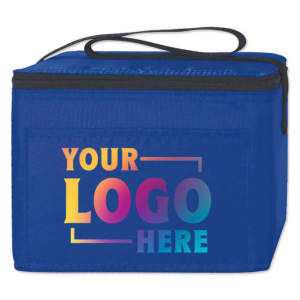
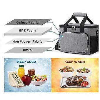
Use custom patterns on materials like non-woven bags or cooler bags to boost recognition. Explore ideas here: JiaRong Cooler Bags

Practical Tip
Design a few signature patterns or outlines and apply them across different platforms.
5. Imagery and Graphics
Pictures do more than decorate—they reinforce your story.
Visual Style Consistency5
- Use the same filters or lighting tone
- Stick to certain illustration or photo styles
- Align visuals with your brand values (e.g., nature, fun, luxury)
Photos and graphics should not clash. Whether you choose bold gradients or soft tones, stay consistent.
| Imagery Type | Ideal For |
|---|---|
| Real photos | Authentic, emotional connection |
| Illustrations | Playful, creative storytelling |
| Icons | Simplify ideas or features |
Practical Tip
Create a “brand photo style guide” to help team members and designers align.
6. Consistency Across Layout and Applications6
Even great design elements lose power without consistency.
Unified Brand Presentation
- Keep element placement (logo, contact info) constant
- Use grid systems for packaging, ads, and social posts
- Standardize spacing, margins, and alignment rules
Brands that apply the same style rules across their website, packaging, brochures, and ads appear more credible.
| Application Area | Why It Matters |
|---|---|
| Website | Builds trust instantly |
| Packaging | Connects visuals to product |
| Social Media | Strengthens recall |
Practical Tip
Audit your brand visuals every 6 months to check for inconsistency or design drift.
Conclusion
Visual identity goes far beyond logos. Each element—color, typography, imagery, and more—builds a stronger emotional connection and helps customers remember and trust your brand. I’ve seen how small changes in layout or font created clearer customer responses.
Make your visuals clear, meaningful, and consistent. That’s how strong brands grow. What part of your visual identity do you want to improve first? Share your ideas below!
-
Explore insights on creating memorable logos that resonate with your audience and enhance brand recognition. ↩
-
Learn how a simple logo can enhance recognition and recall, making it more effective for branding. ↩ ↩
-
Learn how color choices can evoke emotions and influence consumer behavior, crucial for effective branding. ↩
-
Understand the significance of shapes in design and how they can reinforce your brand's message. ↩
-
Explore the benefits of maintaining a consistent visual style for stronger brand recognition and loyalty. ↩
-
Explore the impact of consistent design elements on brand credibility and customer trust. ↩